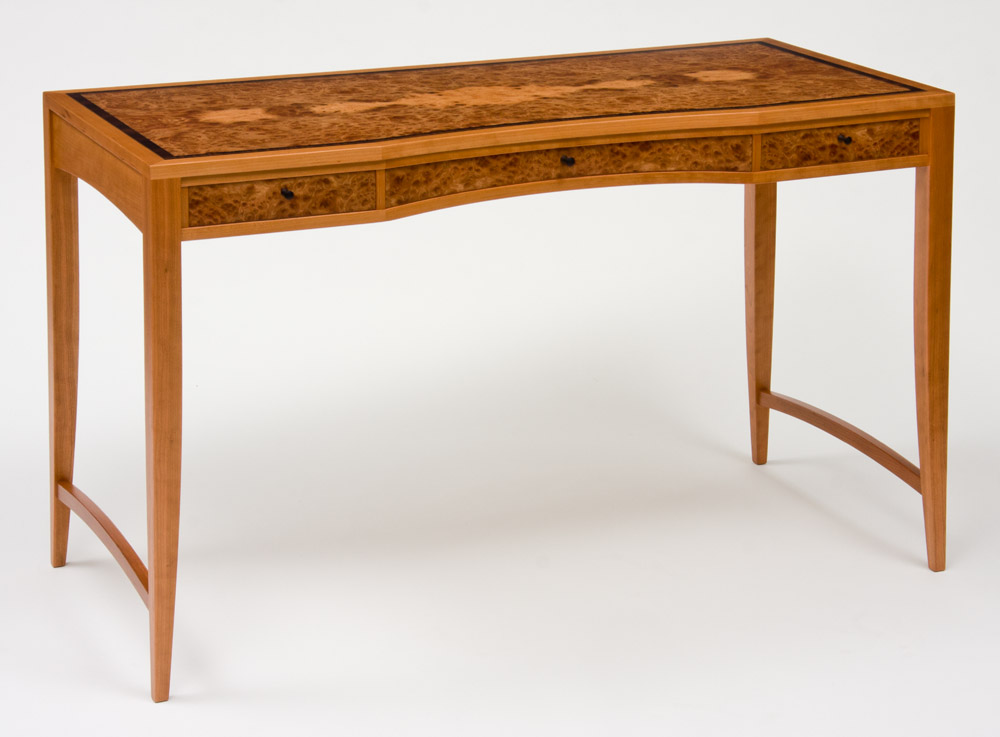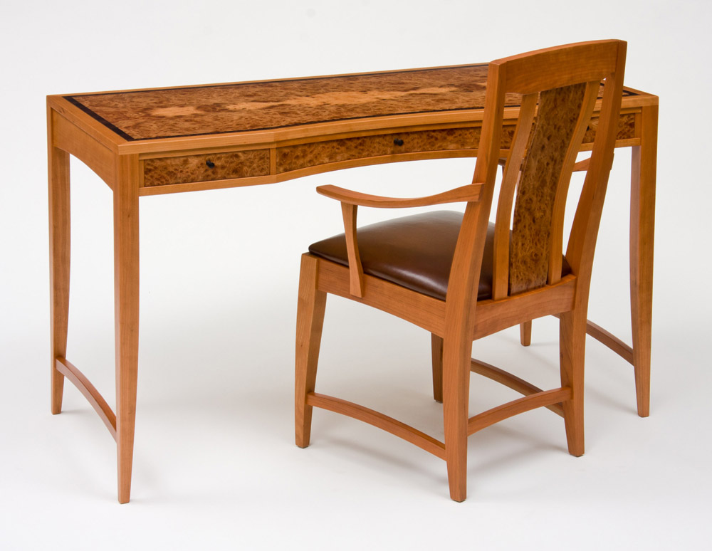
Cherry and Elm Writing Desk and Chair

Listing #3884 Listed on: 05/28/2012 Company Name: CT Fine Furniture
Name: Craig Thibodeau Member
Website:   www.ctfinefurniture.com

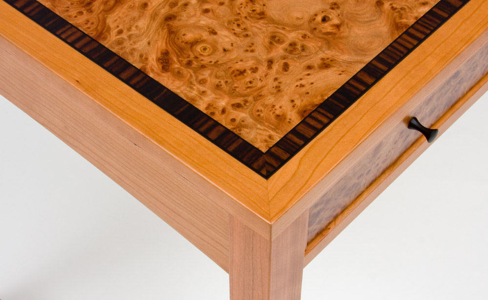
This writing desk was designed as a way to use the leftover arm chair I made with a dining set last year. One extra chair doesn't have much use on it's own but makes for a nice chair to go with a custom desk. I tried to get the desk and chair designs to appear unified as though they were actually designed together rather than at completely different times. As always thanks for any comments.

7 Photos
Social Media:
Viewer Comments:
Posted By:Larry
Very nice.
Posted By:Joel
Nice work of course. I personally think there could be more contrast between the cherry and ebony/burl elements.
Posted By:McKay
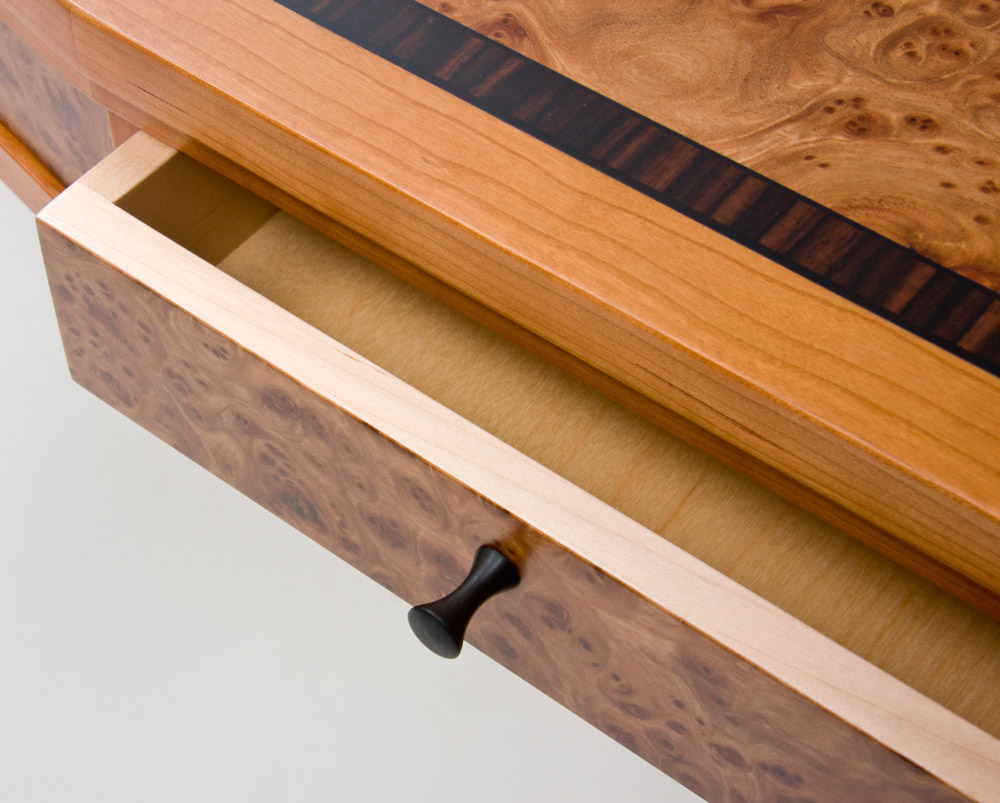
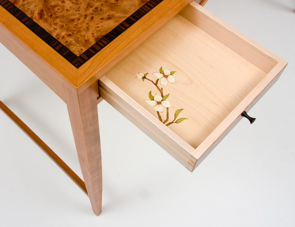
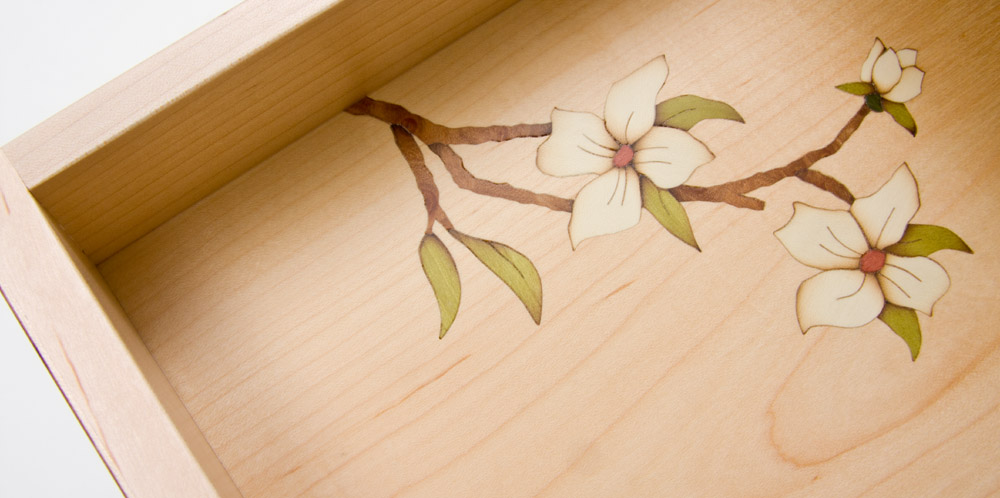
Craig, very nice work on the marquetry and veneer. What brand of vacuum system do you use? Are the bottoms all veneered or just the one with the marquetry?
Posted By:Craig Thibodeau
Thanks for the comments.
Joel, maybe in a few years the contrast will be more dramatic. I have a feeling the elm will not darken nearly as much as the cherry, but time will tell.
McKay, I use a homemade flip-top frame press and an old vinyl bag. Both run off a refurbished vacuum pump. Overall it works quite well, especially the frame press. All the bottoms are veneered from the same batch of maple veneer so the grain is well matched if you were to open all the drawers at once. It's a minor detail but I think that kind of stuff matters.
Posted By:G. Thomas
Very clean and subtle detailing. I like how the two pieces go together, makes a nice elegant set.
Posted By:Rich
Craig, I saw this piece down at the Design in Wood drop-off and knew it was yours based on the table and chair set. Absolutely a beautiful piece in person. Best of luck.
Posted By:Craig Thibodeau
Rich and G. Thomas, thanks for the comments. You are correct Rich, it is in the Design In Wood show this year along with a couple other pieces from earlier this year. I'm not expecting to win much but lots of people will see it and maybe a sale or two will come through.
Posted By:Daniel
Exquisite. Looks fully modern yet also shows thoughtful attention to historical references. Love the proportions. Put it in a museum!
Posted By:Daniel
Exquisite. Looks fully modern yet also shows thoughtful attention to historical references. Love the proportions. Put it in a museum!
Posted By:G. Sforza
Lovely desk. You don't want too much contrast or you'll end up with a motley looking piece of furniture. You want accents that produce the appropriate variation and respect their role in the composition, not some thick, black border that draws too much attention to itself like Liberace at a funeral. However, if it's not the lighting of the room or a setting in your camera (hard to tell since there is variation in the pictures), a stain that is less yellow on what I suppose is maple trim and maybe the elm would be better I think. But in some pictures the color really is more understated and less saturated so I can't say for certain.

Anyway, love it. It seems to me furniture like this could work today.

Add Your Comment:

*Enter the correct numbers into the field below:

Date of your Birth:

WalzCraft Original Saw