Designing a Unique Rocker
Inspired by Nakashima's "Conoid" chair, a Woodweb member gets advice and criticism from the Furniture forum before creating, and executing, his unique vision for a custom rocking chair. March 16, 2015
Question (WOODWEB Member) :
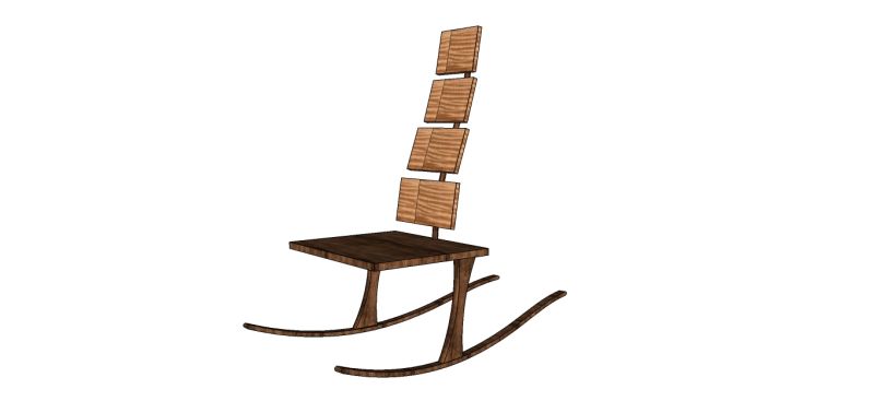
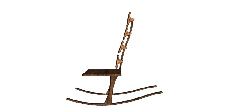
I have a customer who wanted a unique rocker and essentially gave me license to design. That said, I know she is a big Nakashima fan - and I'm a huge fan of his "Conoid" chair. So, I determined to make a rocker with two legs, and to add a back with only one center support - mimicking a spine. Here's the rought Sketchup of the idea.
The two things I'd love feedback on are:
1. Overall design.
2. Attachment of back support to seat.
My first thought regarding the attachment issue is to do a tapered lamination so that there is a much thicker point of attachment and then attaching much like Maloof attaches his legs to his seat. I can already see potential problems with this solution, but am open for reinforcement or other suggestions.

Click here for higher quality, full size image

Click here for higher quality, full size image
Forum Responses
(Furniture Making Forum)
From contributor J:
You're quite a ways off from something that will work but I think something worthwhile could come out of this. First, realize that the Conoid chair already pushes the limits of what's structurally feasible, and yours, as drawn, is exponentially weaker. It would collapse almost instantly if someone sat on it. Take a look at the Conoid. The legs don't just attach to the corner of the seat and reach down to the floor; they go way up above the seat and attach to the top rail as well, making a frame that's far stronger. The same goes for the back legs in Maloof's rockers; there are (organically shaped) rectangular frames there too, making it all much stronger.
What might work is if you were to introduce a stretcher between the legs, maybe six inches off the floor, and bring your spine down past the seat to tie into it. And yes, the spine will have to be much more substantial than the way you've drawn it. The rockers will have to be much, much beefier. See how much taller the feet of the Conoid are where they join the leg? That height facilitates the large, strong bridle joint, and also makes the foot rigid enough to withstand the forces of someone leaning back in the chair or sitting on the front edge of the seat. The leg and foot are of similar cross-sectional dimensions, so stresses are shared between the parts. You're going to have to do the same sort of shaping. I'm guessing that limited Sketchup experience means that what you've drawn isn't exactly what you were thinking of. That's fine; I'm no Sketchup expert either. I'm just commenting on what I can see.
From contributor W:
I am on the same page as Contributor J. Look closely at both Maloof's and Nakashima's chairs: All joints are beefy, solid rectangular joints with shaping away from the joints. The stretcher on the legs is an absolute. I make an armless rocker that my hand knitting customers love. If your customer is average or smaller in stature be careful to fit her in seat height and depth. Consider that the seat should be 1" less than lower leg (floor to back of knee) length to keep their feet on the floor when rocking.
From the original questioner:
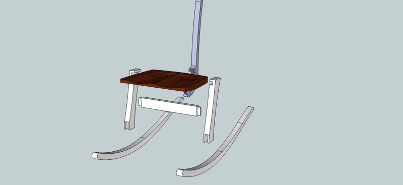
Contributor J: some of my problem is inadequacy with Sketchup, but I also fully acknowledge that I hadn't worked out the solution to the joint issues. I agree with the joints needing more heft - and the stretcher is a great suggestion. I've incorporated a lot of the comments (and spent some good learning time on Sketchup) to show a somewhat exploded view of the joints as I see them now.
Let me know what you think.

Click here for higher quality, full size image
From contributor J:
That's getting better. At the joint between the spine and seat, rather than having that bit added to the spine so it can reach forward to the seat edge, I'd make an extension on the back edge of the seat, reaching back to the spine. With the grain of the seat running front to back, this will be much easier to make strong. The rockers should be taller at the joint and shaped thinner away from it, like the Conoid and Maloof chairs as Contributor W pointed out. The cheeks of the leg part of the leg-rocker joint should be a little thicker, with recesses cut into the sides of the rockers to accept them. Make sense?
From the original questioner:
Contributor J: Great suggestion on extending the seat out to the spine rather than the other way around. I also agree the cheeks of the legs need to be thicker. I'm thinking 1 1/4 total thickness with the cheeks at 3/8 each. I want the bridle tenon to be at least 1/2". Should I go to a full 1.5" in thickness with 1/2" each? The height of the whole bridal will be 2.5" and 2.5" wide. And yes I agree about recessing the rockers to receive the legs. Sketchup wouldn't let me push/pull a curved entity.
From contributor J:
On the bridle joint, I'd split the overall width between leg and rocker. If the whole joint is 1.5" then the center part would be 3/4 and the outer parts would be 3/8" each. Actual dimensions will depend on wood species, and on what looks right. At some point you'll have to step away from Sketchup and build a mock up from cheap lumber, and that will help you refine ideas that are difficult to pin down on the screen.
From contributor K:
I like your design idea, but as all have pointed out, it has lots of special problems. I have done some projects where I needed more strength than I could expect wood and joints to withstand. If you have the ability to work metal, or know someone who can cut your shapes out of steel or aluminum plate, you can cut the shape inside of the rocker and leg finish dimensions. Then, with a router, inlay that into re-sawn parts which get glued back together with thickened epoxy around the metal. I did the inlay in a wider plank before sawing the final shape, which can be up within about 1/8" of the metal. If the glue-up is good, the lines don't show, but it is as strong as the metal but looks like wood. You could do the same with the back spine, making the turn under the seat, letting it run in a good ways for strength, and maybe buried under a cover plate of wood. I like using heavy plate aluminum or bronze. I have cut up to 3/4" with my wood cutting bandsaws.
From Contributor F:
The design looks good but how are you going to make back support? In the picture, the back support is built on a single stick. I think the back support must be a little wide and it should be built on a full back support. And yes, arms are a necessary part of such a chair.
From the original questioner:
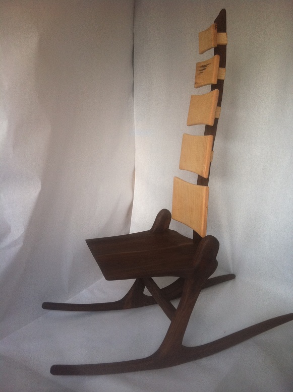
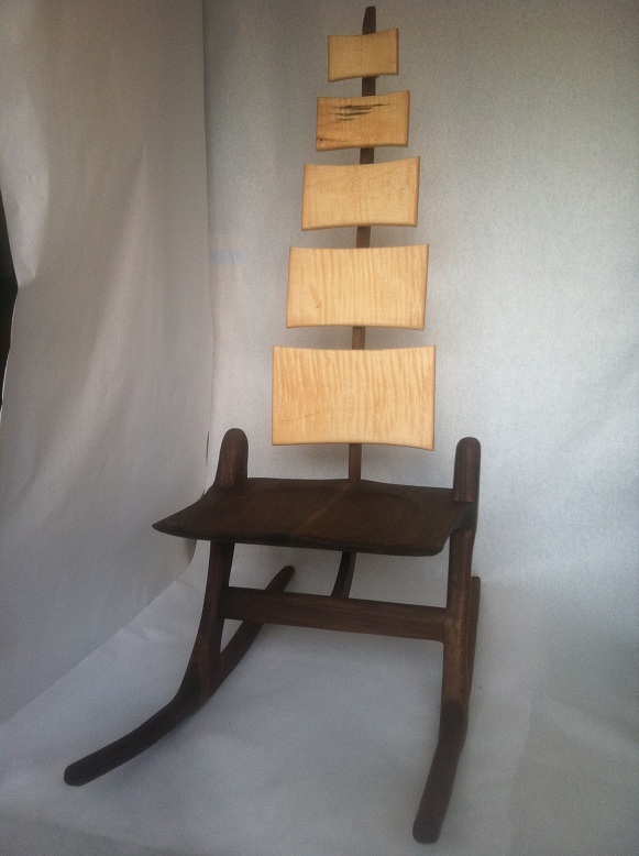
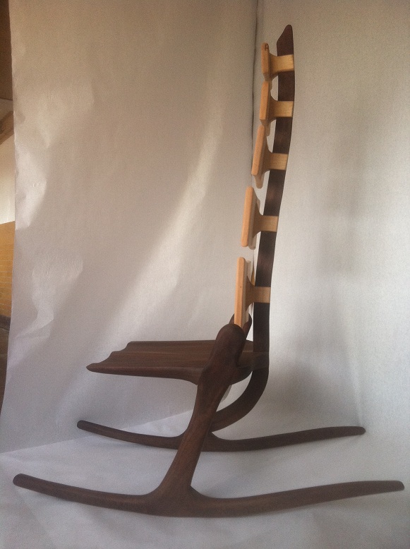
Well, folks, it's finished. There are a few things I will tweak for version 2.0 but I am pretty pleased with the result. Everything started out as 8/4 walnut and then I sculpted away from the joints. These joints are very sturdy. Actually, I discover that it is more stable being a rocker rather than a stationary conoid. Because it rocks there is not as much torque on the joints. The tricky part was getting the angle of the legs-to-seat and legs-to-rockers just right, so that once you sit on it, it naturally takes you into rocking, rather than requiring you to work at it. I did a full scale mock-up in MDF first, which proved to be all-important. I will add arms to the next one (customer didn't want them). I will do this by extending the legs up to arm height and then curving the arms around the back to the spine (adding side-to-side stability to the spine).

Click here for higher quality, full size image

Click here for higher quality, full size image

Click here for higher quality, full size image
From the original questioner:
The chair was displayed at a furniture show recently. At least 200 people (of all sizes) sat in it. Many thought it should have arms. Some didn't like the rocking motion (which could be improved, I think, by changing the angle of the leg to the seat). But no one thought it was fragile or unstable and there were a few heavier folks who gave it a go.
From contributor W:
What radius did you use on the rockers? After talking with a few rocking chair makers, I have settled on 42" for the outside radius for my rockers.
From contributor J:
Congratulations, it's neat to see this coming to fruition. Design-wise, I have a few suggestions. I think it would look much better if the legs, when viewed from the side, extended/echoed/imitated the curve of the spine. As it is you've got relatively straight legs intersecting the spine in a way that makes them seem like totally unrelated elements that happen to be next to each other, rather than extensions of a whole.
Rather than topping the legs with a full radius, which looks incongruous given that there are no other 180-degree or similar curves in the rest of the chair. You might try a straight-ish line or gentle curve, parallel to the seat, with softened corners. The straight front edge of the seat also looks a bit out of place to me, like it's been abruptly chopped off, and I wonder whether that couldn't be made to flow a little better. Have you considered a low-backed version?
From the original questioner:
To contributor W: I may have done well to consult a few rocking chair makers. My radius is much less steep: approx. 50 degrees. In addition to changing the angle of leg-to-seat and leg-to-rocker, I definitely want to shorted up my radius a bit and extend my counter-curve out a little further. That said, it rocks fairly nicely as is. But it�s more a posture chair and less a lounging chair.
From the original questioner:
Thanks for the feedback Contributor J. I definitely like the idea of straightening the top of the leg parallel to the seat and softening the edges. The fact that the legs extend past the seat is more functional than aesthetic. If they went flush with the seat, there would be just a relatively thin cheek on the bridal joint and I wanted to shore that up. Once I made that decision, I kind of pictured these extensions as hips. At that point I had a spine and hips. So the legs truly became legs. I guess I was working for more of a femur look! For the flow, however, I agree that it may be easier on the eye if it continued the type of curve of the spine.
From contributor J:
Hips. I can see other parts that have a skeletal sort of look, especially the back support assembly, with its vertebrae-like planks. I skipped right past that theme at first. I'm glad it's working out structurally. You now have a good base from which to experiment.
