Flute Size and Spacing
A discussion of the subjective esthetics of fluted pilaster layout and style. February 11, 2010
Question
I will soon be starting a built-in that calls for fluted pilasters on the two outer stiles of the cabinet. I was planning on the material being 3 1/2" wide, and they will be 81" overall height. I haven't had a call for fluted casings on any projects I have done in the past 5 years, so I was looking for advice on the size and spacing of the flutes. Is there a typical relationship of width and space that is most appealing? I was thinking of either 4 flutes 3/8" wide, or three flutes 1/2" wide.
Forum Responses
(Cabinetmaking Forum)
From contributor K:
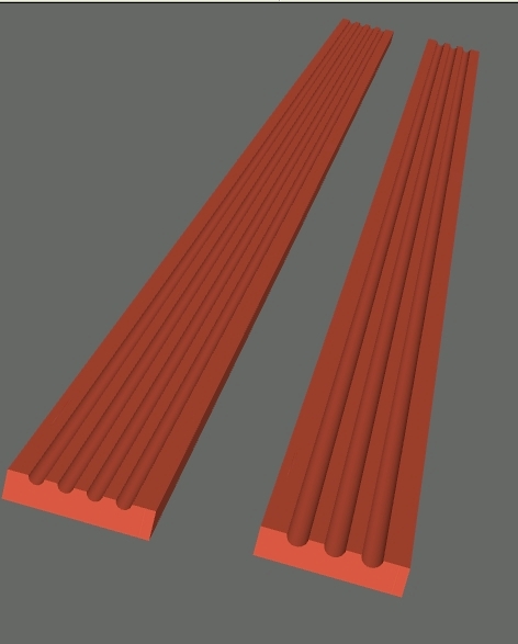
Here is what they would look like:

Click here for higher quality, full size image
From contributor M:
We make them 4" wide, 3 flutes (3/4"). They look like contributor K's picture, on the right.
From contributor C:
No relationship to my knowledge. What does look way better than stopped or straight flutes are tapered flutes (at the ends). Make a ramp for your router to ride on. Looks much better than the latter, in my opinion.
From contributor S:
I agree that flutes tapering at the end look way better and more traditional rather than CNCed in appearance. A router is not a good tool for cutting a flute because it is tearing out one side as it cuts. You can see this in the quality of the cut.
The best approach I ever saw was a corrugated head on a shaper (they made 5 flute pilasters). A long fence was added to the shaper (almost twice as long as the moulding) with adjustable stops on each end. A box jig would be screwed to the back of the moulding. Working right to left you would push the right end of the moulding against the stop at an angle. Now you would plunge the left side into the cutter. Then you would push from right to left until the left corner hits its stop, at which point you would pull back from the cutter. Great tapered flutes that needed next to no sanding.
But just to show what a crazy tasteless world we live in: they told me they once had a customer reject a job because they wanted the CNC flute look.
From contributor J:
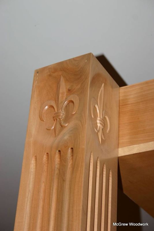
I am not sure what "CNCed" fluting is as a pattern, but I do these on my CAMaster using Aspire (or Vcarvepro) software. It has full capacity for determining ramp, type, distance, depth, etc. Design is subjective, symmetrical and spaced to the eye.

Click here for higher quality, full size image
From contributor V:
I would have to agree with contributor J. I do ramped flutes on my Thermwood router that require very little sanding and I can make the ramp length whatever the customer wants. Done in minutes.
From contributor S:
I should have said routered without ramping. Finishing in a full depth half circle. I don't find this look to be traditional or mimic how it would have been produced with hand planes. However many people prefer it. CNC machining is better, but hand and table routers tend to leave the second half of the cut very rough compared to the shaper.
From contributor R:
If you are interested in a traditional pilaster, 5 or 7 flutes would be correct. The width of the flute should be sized to allow the space between to be about half of it or less. Some good references would be the "Parallel of the Classical Orders of Architecture," "Chippendales Directory," and the 20 volume series "Architectural Treasures of Early America" published by the National Historical Society which has many photographs and measured drawings of fluted pilasters.
I think you would be hard pressed to find examples of the elongated or fingernail shaped termination of the flute created by ramping in to the cut or cutting with a large diameter cutter on a shaper or saw. It is also effective and easy to cut stop flutes with a plunge router and sliding jig. Set your dead stops to take a couple rough cuts and one last cut for removal of a minimal amount of material to eliminate tearout. Lifting the bit out the second the router reaches the end will minimize burning at that point. Light passes and smooth continuous movement will do the job.
From contributor D:
I will echo contributor R's capable response. It is always wise to look at history for accurate precedent.
Flutes should always stop in their own diameter - no ramp or taper. This was done by hand 2500 years ago, and the skill of the carver and the builder was shown by such a detail. Fluted pilasters are representations of columns, and columns are representations of trees, with the flutes as the texture of the bark.
From contributor K:
Contributors R and D, I vote with you guys. I have never liked the ramped/fingernail look. I think this type of flute came about from trying to do stopped flutes with large diameter cutters. Ugly in my opinion.
From contributor B:
Contributor D has it partly right. Columns are stylized representations of the vertical logs used in primitive building. The flutes are not necessarily the bark, but the long vertical cracks which inevitably develop in the log itself. The bark and branches would have been removed or fallen off. The typical turned base at the bottom and top of a column is the rope cordage or leather windings used to bind the cracking log together. The plinth block sub-base was the stone foundation which the logs were set upon. The upper carved Corinthian capital (for example), with its intricate floral patterns and vertical spiral motifs, is the sprouting vegetation and vines that occur along the top of the log. Pretty cool, eh?
The dentil moldings of the upper architrave are obviously the ends of the horizontal roof sticks of a primitive structure. All of the floral carving and embellishments are representations of the clinging Mediterranean vines and vegetation. Take a look at a traditionally carved floral bracket beneath the end of a stair tread and tell me what you think. (More sprouting weeds between the stones?)
Anyway, I think it's interesting that our great western architectural heritage started out as a pile of sticks and stones and unwanted weeds and vines.
Ref: The American Builder's Companion by Asher Benjamin, Architect and Carpenter,1827
From contributor P:
Beauty is in the eye of the beholder... Just remember not to insult the eye of the beholder in the process with your concept of beauty.
One thing to keep in mind when replicating historical design is that in time, what you do today, if a design you do becomes popular, will one day also be history. So don't be afraid to step out and make yourself different and potentially make some history of your own.
That is how more recent designs (within the past two centuries) have become famous. In most cases, they didn't set out to make history, but they weren't afraid to make themselves unique.
From the original questioner:
Thanks for all the replies! Not sure which way I will go, but lots of food for thought.

