Question
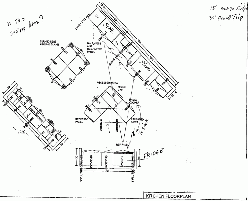
What is the current maximum kitchen work triangle? I have a client who gave me some plans showing the fridge 20 feet from the sink. It's 20 feet due to the trek around the island. The only other place the architect has left in the room puts the fridge about 15', which is still a lot. The 40 foot round trip from the sink to the fridge is just plain nuts. Does anyone know the maximum recommended by the NKBA?
Forum Responses
(Cabinetmaking Forum)
From contributor J:
Don't know about NKBA, but the Interior Graphic & Design Standards has...
"Total distance between the three major work centers: A plus B plus C Maximum distance: 22' (6.71 m); minimum distance 12' (3.66 m)"
The work centers of course being sink, fridge, stove. They don't list the distance for just two centers, but since they've exceeded the necessary distance already, I guess you wouldn't have to worry about it.
I find architects don't spend a lot of time/energy designing kitchens. I usually get a set of house plans with a basic kitchen floor plan and then it's time for me to go to work. If this is what you're working with, I'd start revising pretty quickly. If it's a more detailed plan/design, you may want to see if there was some reason for the layout, as it seems a little awkward.

It'll give them a little more freedom, and being that it sounds like they are in the middle of construction, it shouldn't add that much of an up-charge.
Some points about the kitchen I find impractical are: the refrigerator placement. Besides your concern about distance, there is no countertop to put things down when loading/unloading without walking over to the island. Not sure of the distance there, but I'd guess about 4'. Sure, it'll probably look nice with all tall cabinets on that wall, but practicality suffers.
Second, I agree that there should be a prep sink on that island in a kitchen that size. Third, I don't see any drawers near the sink/stove area (maybe in the B33?). I like to have at least one drawer near the stove for utensils.
Fourth, for me, there are too many cabinets with doors. I prefer as many drawers as possible, as I believe they are much more practical storage wise. Although they do raise the cost, I've never had a client regret me talking them into more drawers.
All in all I really don't like the design - too much distance, and that angled island just seems like it's always going to be in the way. Don't really see a need for two separate islands anyway, at least for practical reasons. Maybe if you made the current sink a prep sink, and put the main sink on the angled island, then shifted a few other things around a bit, it could improve the flow. Or merged the two islands into one centered in the kitchen? But as is, I think it will look a lot better than it will work. That's just my opinion and probably won't impress your client much...
At the very least, move the sink down to the right... Ditch the 9" tray bases. They are useless. Do you own one? I do. I put one in only when I have to in designs. 12", or better 15", or even better 18" tray bases should be the norm. I prefer a full height tray base 15" with a horizontal shelf on the top for cake pans, etc.
Dishwasher on the end = loud, by the way. I see you already have a DOV and a range. 3 ovens? Are they catering in there? These people need pulled back to reality. I actually have built kitchens where three people were going to be working full time catering in the thing for special events from time to time - so it was a burden to make it functional, large enough, yet small and pleasing to the eye enough for when they don't have any projects.
I honestly think these people are going for the ultimate dream kitchen and are going to realize quickly that they are getting very tired to prepare a simple mac and cheese dinner for their kids. I would suggest dishwasher drawers and a dishwasher, if they want more dishwashing power, instead of two dishwashers. Never three ovens. I would prefer to see a wider DOV, wider ovens with maybe a warming drawer, instead of three ovens.
The sink needs centralized. You could put it in on the island as suggested, and the cook top over where the sink is, but centered. But like I said, if it were me, I would do a complete redesign, as this one is all style and zero function.