Kitchen Design: Symmetry Versus Functionality
Here's a nice exercise in cabinet design: Whether to choose cabinet sizes for symmetrical appearance, even though it will call for special hardware to make a trash pull-out work.January 31, 2012
Question
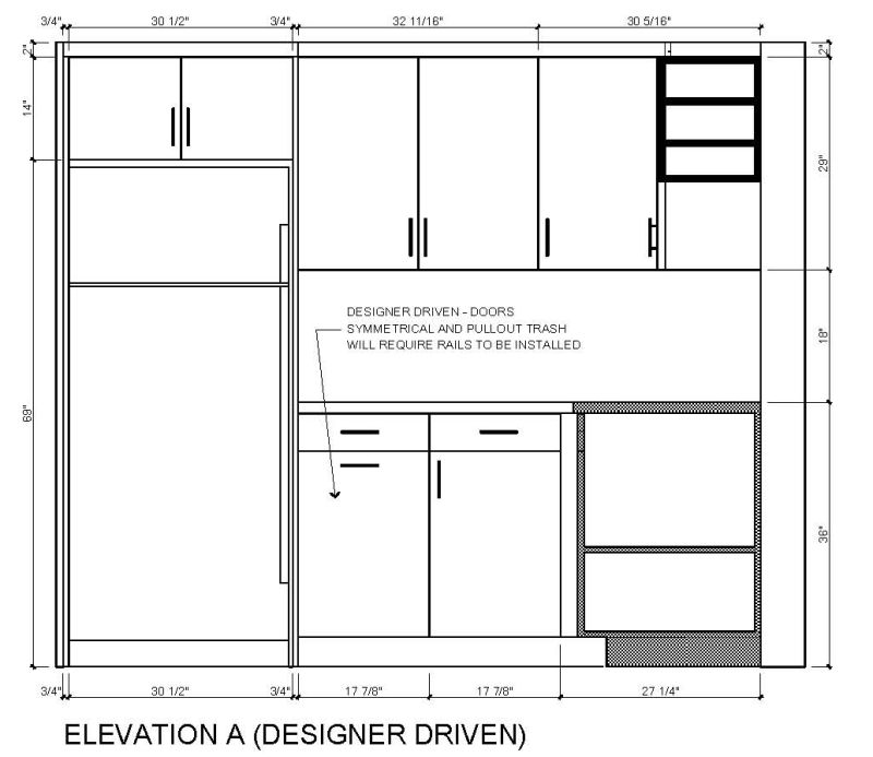
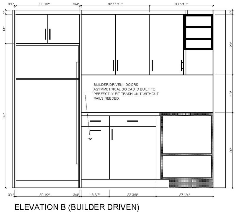
This is a debate my designer and my builder are having. The designer loves symmetry and is usually driven by looks (Option A) while my builder likes practicality regardless of how off something looks (Option B). I have my opinion but I want to hear which option you would go with.

Click here for higher quality, full size image

Click here for higher quality, full size image
Forum Responses
(Cabinet and Millwork Installation Forum)
From contributor R:
A
From contributor U:
B
From contributor L:
B. Better utilization of space! What makes symmetry better?
From contributor T:
If you look around a little harder, you can find a trash unit (Rev-a-Shelf,
Hafele) that is closer in size to unit A and eliminate the rails. This will allow the designer to get something closer to what he/she wants and still make it just as easy to build as B.
From contributor J:
A. With very minor tweaking there's a trash pullout that will work within A's parameters.
From contributor D:
I assume this is not a spec house. What does the owner like?
From contributor F:
A. Find a trash unit that fits the space.
From contributor P:
A, as the top doors line up over base.
From contributor B:
Another vote for A and finding a pullout unit that will fit.
From contributor O:
A
From contributor V:
Without knowing what widths are around the corner, there's no way to know which works better. A isn't really symmetrical because the upper and lower faces aren't aligned.
From contributor N:
A. Get a can that fits.
From contributor M:
A. Try a double bin that is wide enough to fit.
From contributor C:
A. Symmetry is the subtle difference that separates the good, the bad and the ugly. Or, "I can't put my finger on it, but something is odd with B."
From contributor V:
Hafele Euro cargo 50 will fit that space. Item #502.73.932.
From contributor F:
This thread brings up another interesting point. The builder should be silent in this matter. The builder's job is to build what the designer designs, without voicing an opinion.
From contributor W:
A looks like a bad job of symmetry while B looks more like intentional asymmetry. I would go with B.
From contributor Z:
A may look a touch better, but with the size of that kitchen I doubt they're generating that much trash and would like the additional storage as given by B, especially if that's the way into a blind corner. The starkness of elevation views points it out. But in real life I doubt too many people will notice.
From contributor K:
Ah, the old form versus function debate... While the case can be made for both, based on the position of the cabs, and with the fridge to the left, it really doesn't matter regarding the asymmetry. In A, the base cabs are not symmetrical to the uppers, as the center line is offset by almost 1.5".
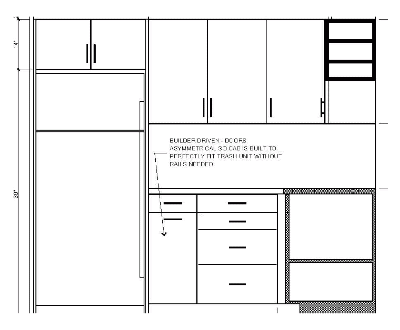
I'd go another way. Best way to negate the symmetry issue altogether is to go with B, but make the base cab to the right a drawer bank. It centers the center upper door (see below), while still giving you the functionality you are looking for, not to mention get yourself more money in an upsell.

Click here for higher quality, full size image
From contributor Q:
I agree with contributor K.
From contributor I:
That's a good alternative, but I'd make the base and upper cabinets immediately to the right of the fridge the same width to give a little symmetry.
From contributor K:
Only problem is that the numbers don't work. That is what is done in A above, but it is actually offset by about 1.5". The other problem with A is that the 1.5" offset is amplified by the right base cab vertical pull on the door, drawing your eye towards the offset of the base cabs versus the uppers.
By changing the base cab to a drawer bank, you change the focus and you get an upsell to boot, and remove the offset. It also reverse-aligns the bottom left base cab with the upper to the right, as they are both about the same size.
Just an alternative. I don't see the problem as being that big of a deal considering where the fridge is, but it is hard to really know without the total footprint to look at. Probably wouldn't be noticed in the real world.
From contributor V:
We don't know if a symmetrical A (equal width uppers and lowers, smaller corner cabinet) works because we don't know the size of the flanking doors. If the size of the three upper doors is carried around the corner, making the trash door the same size as the door above it might be the way to go (the slightly wider right door will catch the eye less than the offset reveals). B might be good if there is a flanking base close to the same size as either door (22-3/8 or 13-3/8). Contributor K's solution is another great possibility.
